Shelburne_Falls_MA_U.S.A.
Flood Mapping the Deerfield River
Project maintained by dclement1 Hosted on GitHub Pages — Theme by mattgraham
Shelburne Falls, MA, U.S.A.
Project By: Daniel Clement
This project will examine the flood risk posed by the Deerfield River, on the town of Shelburne Falls, Massachusetts. This town has been affected in the past by flood events, depicted in the video below. Having a better picture of specific areas which could be problematic in future flood events would be extremely useful. To this end I have performed analysis on the area and will make recommendations on problem areas that official government planners, first response agencies such as FEMA, as well as local authorities can focus on, while planning for future disasters.
-
The data used in this project is a subset of the larger data set entitled: “2012 FEMA Topographic Lidar: Hudson-Hoosic and Deerfield Watersheds, Massachusetts” which was itself obtained from The National Oceanic and Atmospheric Administration (NOAA), and their website at the following links:
- NOAA Costal Data - https://coast.noaa.gov/dataviewer/#/
- Direct Link to Project Data - https://coast.noaa.gov/dataviewer/#/lidar/search/-8098894.886584386,5250798.662221772,-8095932.951738335,5254343.429408497
- Below are two YouTube video of the flooding in the town of Shelburne Falls which was caused by Hurricane Irene in 2011. They show the true power and devastation of these flood events and illustrate why it is important to do studies such as this one. The first video was posted to youtube by the user “Wanda P” and the second video was posted to youtube by the user “ Pilotwear & Diecast Airplane”.
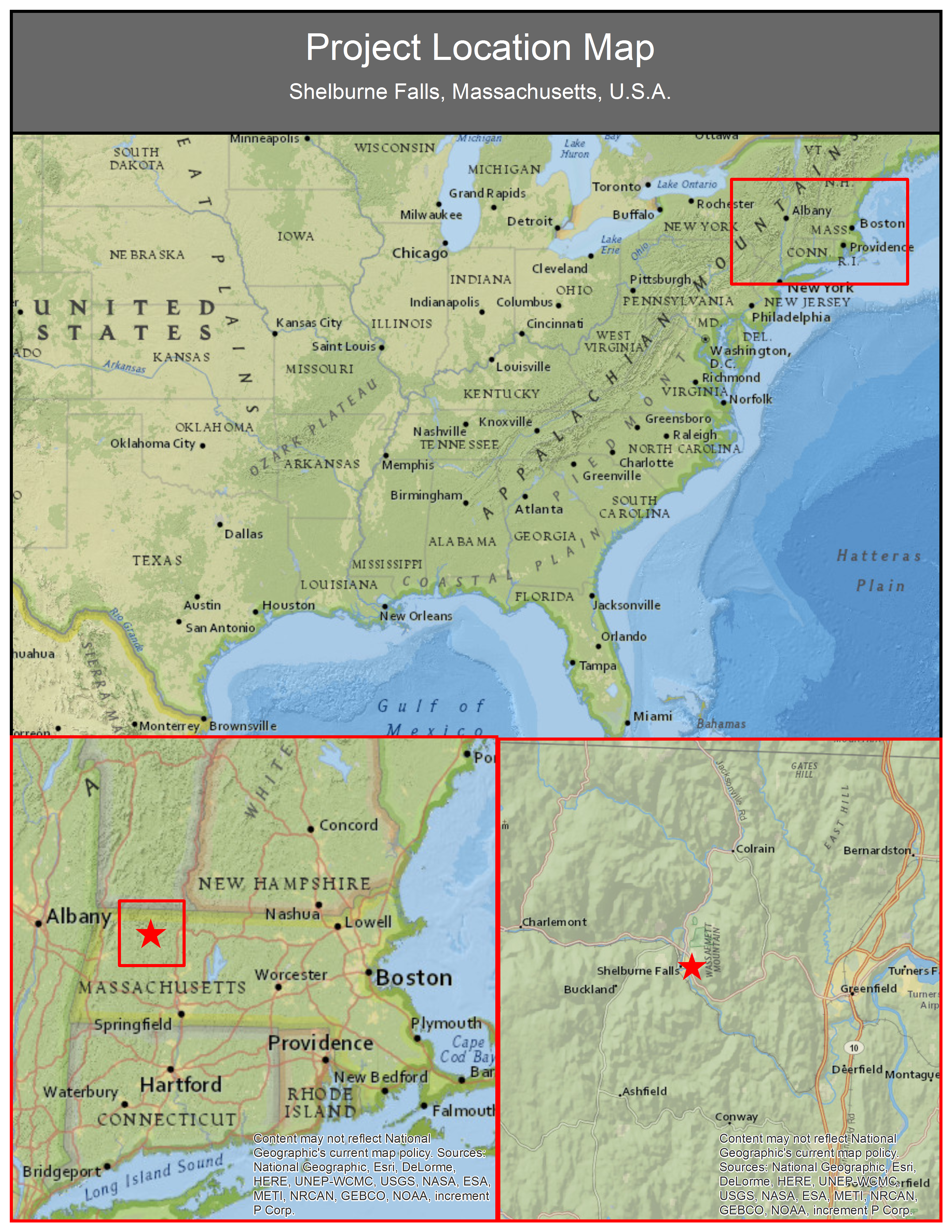
Project Location and Area Extent
-
Below is a map of the location of the project made with ESRI’s ArcGIS.
-
Below is an embeded Google map, in which you can view the loacation of the project.
A Bit about Remote Sensing and LIDAR
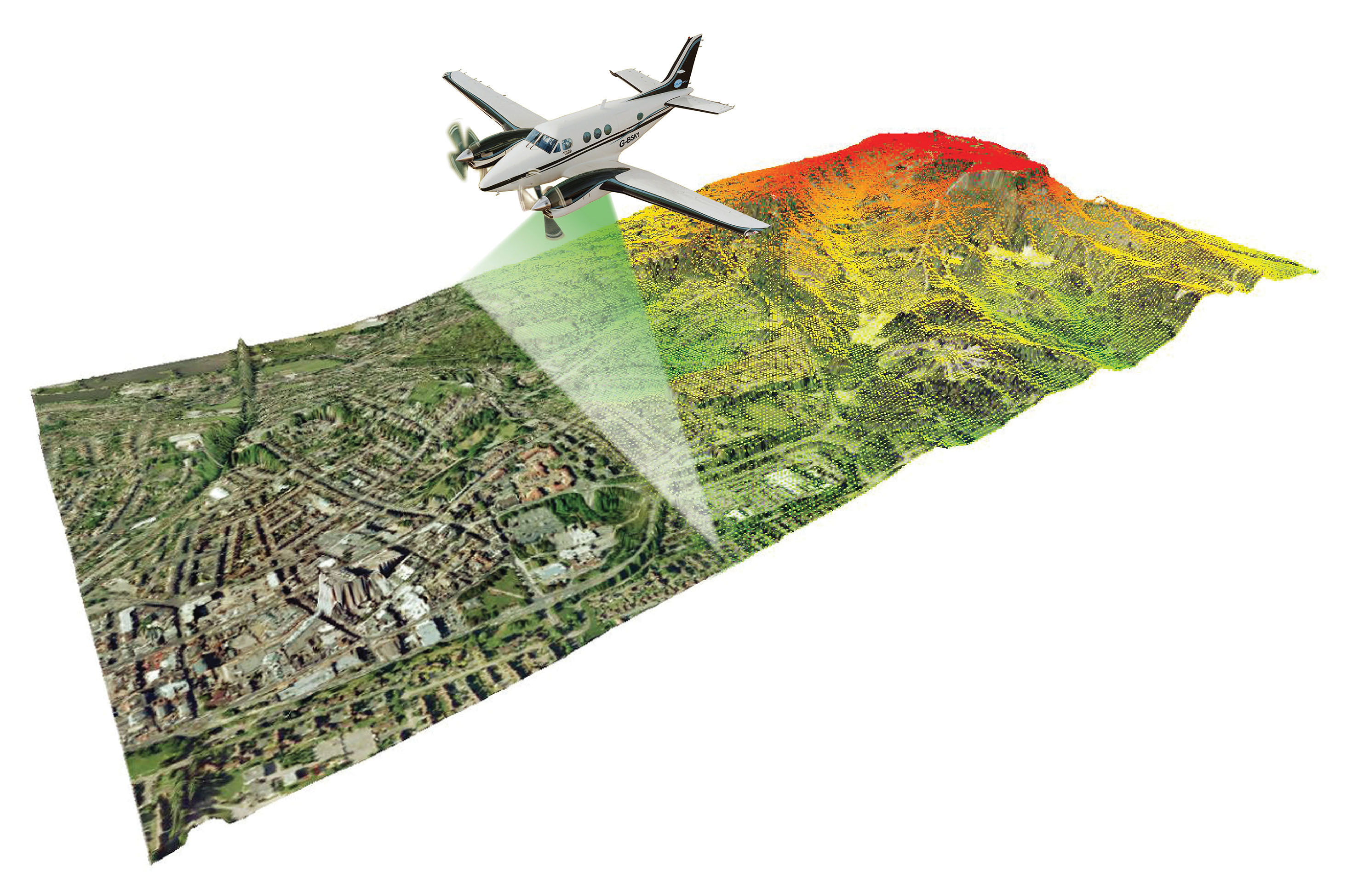
Our main data source was a LIDAR point cloud obtained from the National Oceanic and Atmospheric Administration’s coastal LIDAR data portal. LIDAR, which is a type of sensor that is generally on an airplane or satellite, fires laser pulses at the ground, and records their return signatures. This gives us a very accurate representation of the elevations of the surface of objects such as trees and the ground. The resulting set of elevation points is what we refer to as a Point Cloud. The point cloud for our Data is made of 2,093,340 points.
-
The first image below is an illustration of how LIDAR sensors are used to collect data. LIDAR sensors are commonly placed in the belly of light aircraft, which fly at relatively low altitudes. Source: LIDAR-America.com
-
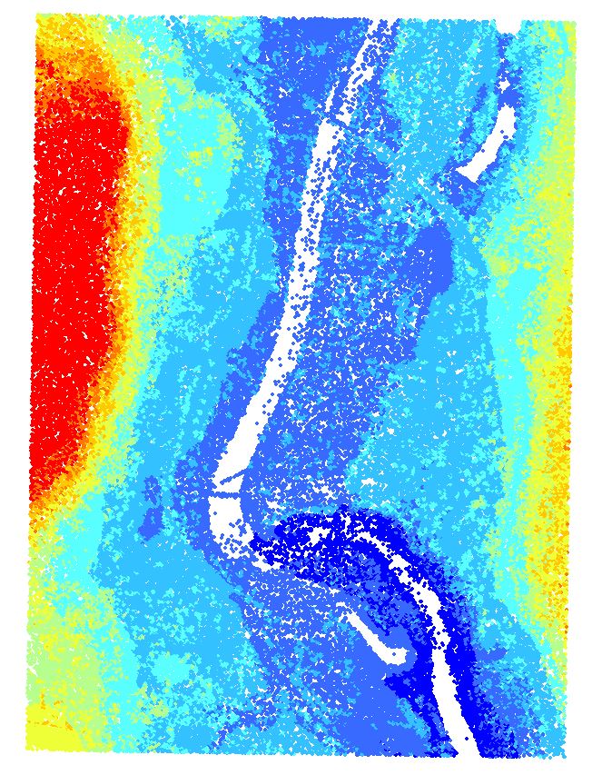
Below is an image of the point cloud of our data. The different colors represent various elevations, red symbolizing higher and dark blue being lower in elevation.
-
Below is a zoomed in version of the point cloud showing how dense the points are. This data has a point density of 2 points per square meter.

-
Below is an interactive form of the point cloud, which you can manipulate and see from any angle and zoom in on. To pan the camera, click and hold down the left mouse button, while dragging the image around. To zoom you use the scroll wheel on the mouse. Please spend a few minutes with this 3d visualization to gain a better understanding of the point cloud concept.
Flood Analysis
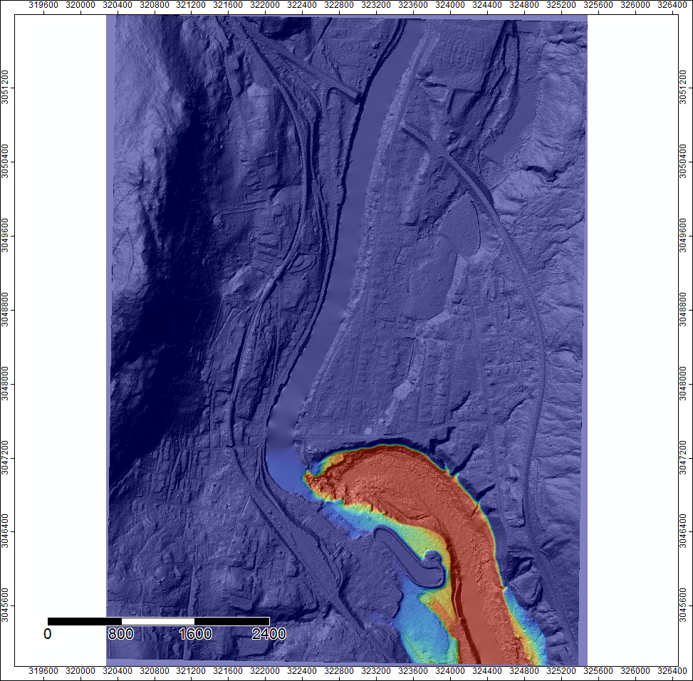
To perform the analysis, an open source program called SAGA GIS was used to perform and create various analysis and visualizations. One of the first analysis performed is a flood simulation showing what would happen if there was a 2.5 foot increase in the depth of the river and the dam overflowed.
-
Below there is a digital terrain model, showing the surface of the ground, this is overlayed by the flood simulation. Looking at this it becomes evident that there are several buldings and houses at risk inside the flood zone.The red shadded areas signify the worst flooding and the blue areas represent less flooding.
-
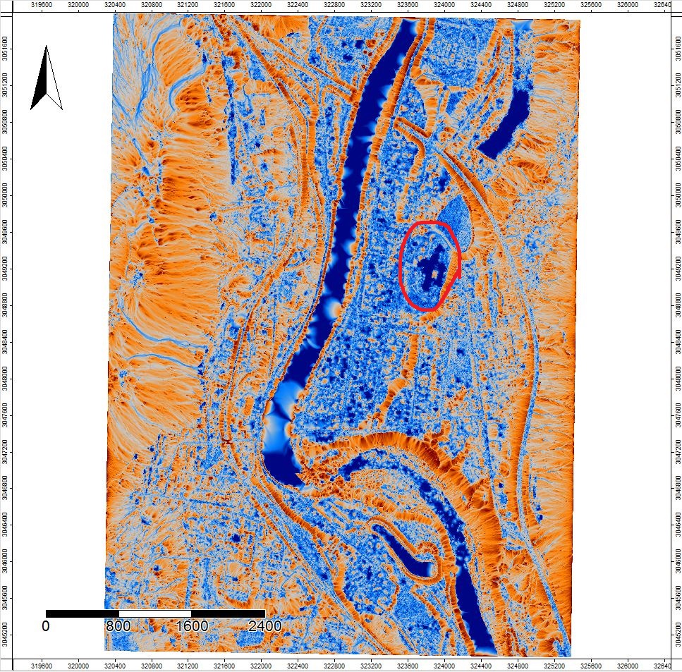
The image below, displays the result of the Topographic Wetness Index analysis. This uses the micro-topography, or small changes in elevation, to determine areas which would tend to hold water. This is important to visualize because it highlights areas which are more vulnerable to flooding. In addition, this knowledge can lead to better planning, which can seriously diminish the severity of the effects of future flood events. Some interesting features to note here are that to the East of the river, the wetness index is very high compared to the western side. This leads us to believe it would be beneficial to focus on this area in flood prevention planning. Another area which could be at risk is the school which is circled in red. This area is very blue, signifying this area is in a low spot and should be another area of focus.
Conclusions
The town of Shelburne Falls, located in North Western Massachusetts, U.S.A has been the victim of floods in the past. With this in mind, this project set goals to analyze the flood risk posed in a theoretical 2.5 foot flood. As a result of this analysis several areas have been identified which could be succeptable to flooding in the future. The entire Eastern shoreline is low, and will tend to hold water. This could be particularly problematic for one public school, Buckland-Shelburne Elementary, which is located in this area.
Recommendations
Past events, such as flood in 2011 caused by Hurricane Irene, clearly illustrate the importance of being prepared for future disasters. Proper prevantative emergency planning could go a long way towards protecting people and property in the next flood event. Performing a flood analysis on Deerfield river provided several insights. Namely, several areas which are more susceptible to flooding than others. These areas, which are on the Eastern side of the river in the town of Shelburne Falls, are low in elevation and would trap water in a flood situation. One key location which would be at severe risk is Buckland-Shelburne Elementary. This school is situated around 800 feet away from the bank of the Deerfield River. I would recommend a more thorough risk mitigation study be carried out by engineers, and a plan developed to minimize the danger to this school as well as the surrounding area. The other risk area identified is essentially anywhere south of the dam. This area will be severely inundated by water in the event of a flood. The developement of plans to lessen the effects of a flood in Shelburne Falls can only be beneficial. The fact that another flood is inevitable, leads me to believe that these planning efforts are of urgent importance. Consequently, a faliure to carry them out soon, could lead to catostrophic consequences in the future.
Further Readings
- Flood-Inundation Maps for the Deerfield River, Franklin County, Massachusetts, From the Confluence With the Cold River Tributary to the Connecticut River; USGS https://pubs.usgs.gov/sir/2015/5104/sir20155104.pdf
Applications used:
- SAGA GIS - http://www.saga-gis.org/en/index.html
- RapidLasso’s LAStools - https://rapidlasso.com/lastools/
- ESRI’s ArcGIS - http://www.esri.com/arcgis/about-arcgis
- GitHub - https://github.com/